
A humorous reminder that no matter how people vote, or what parties they may affiliate with, there is one sure common denominator, whose extrapolation is simple: people are all people. Design by Chris Lee Jones. Wearable as shirts, at Threadless.com.
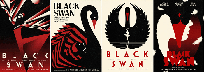
Posters with Hand-made Flavor


These poster designs by Lowe Steiner are boldly typographic and playful yet maintain a clear hierarchy, making them intriguing and easy to follow.

Internet Lesson for Oliver, or Other Former Street Urchins
This tongue-in-cheek set of scenarios elevate The Flowchart beyond its typically straightforward task of organizing information and situational permutations in business. "Explain the Internet to a 19th Century British Street Urchin" leads the 21st century reader through a set of humorous, anachronistic revelations, and undoubtedly illustrates the kind of humor and creative thinking in Doogie Horners book, Everything Explained through Flowcharts.
See Detail on FastCompany
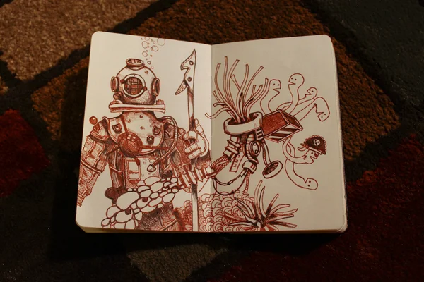
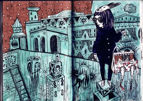
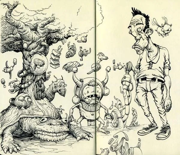
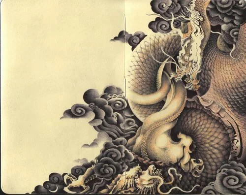
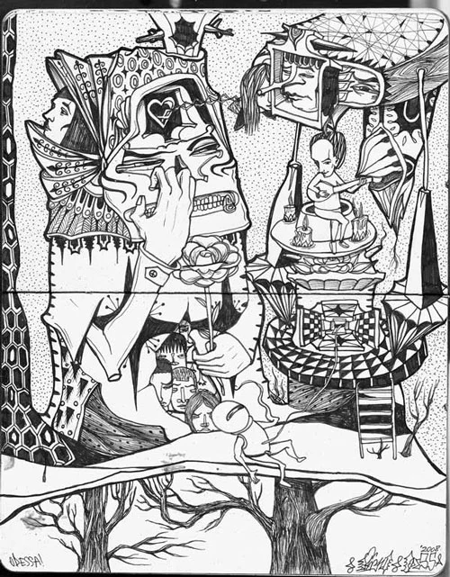
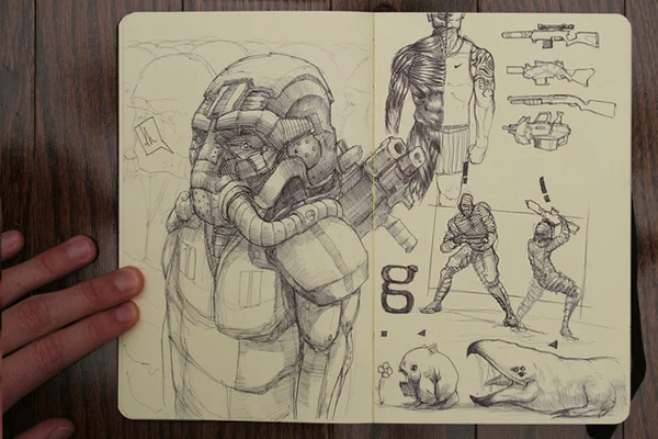
Talented Sketching in Moleskines
Wrapping Paper for Any Occasion


Designed as a word puzzle made from "Happy Birthday," "Merry Christmas," "Congratulations" and a slew of other greetings, this paper design simplifies gift-wrapping with one sole paper, regardless of occasion, while adding a layer of interaction for both the giver and the receiver. Credit: Fabio Milito and Francesca Guidotti.
Living Environments—Rachel Armstrong
In this TED talk, Rachel Armstrong describes the innovative breakthroughs of synthetic, living materials and their vast applications in adapting and retrofitting our environments, such as in preventing the sinking of Venice.
See related:
- Neoplasmatic Future Homes: How synthetic algae skins on homes could improve energy use.
- The Architectural Tricks that keep Venice Going: How Venice is managed with architectural and engineering tricks designed specifically for Venice's conditions.
Pirate Ship Bedroom Design


More than just a decorative touch, this pirate-ship bedroom connects the ship with a jail cell through a rope bridge, dangles a climbing rope from the ship to the closet, and hides a slide that brings the adventurous kind downstairs, to the home's ground floor. Wow. Designed by Steve Kuhl, Kuhl Design Build.
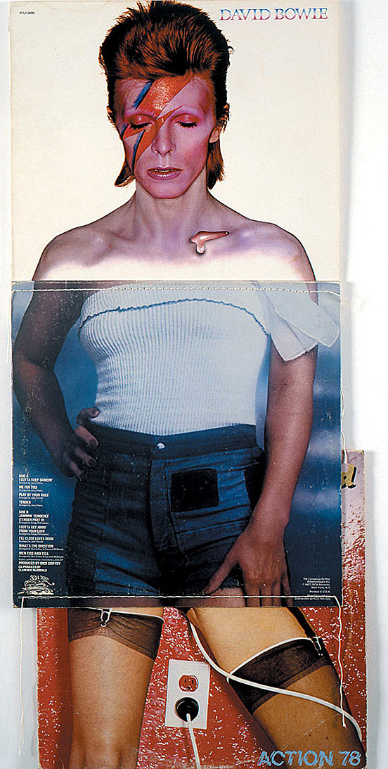
10 Creative Album Cover Collages


Andreas Captures Massive Architecture
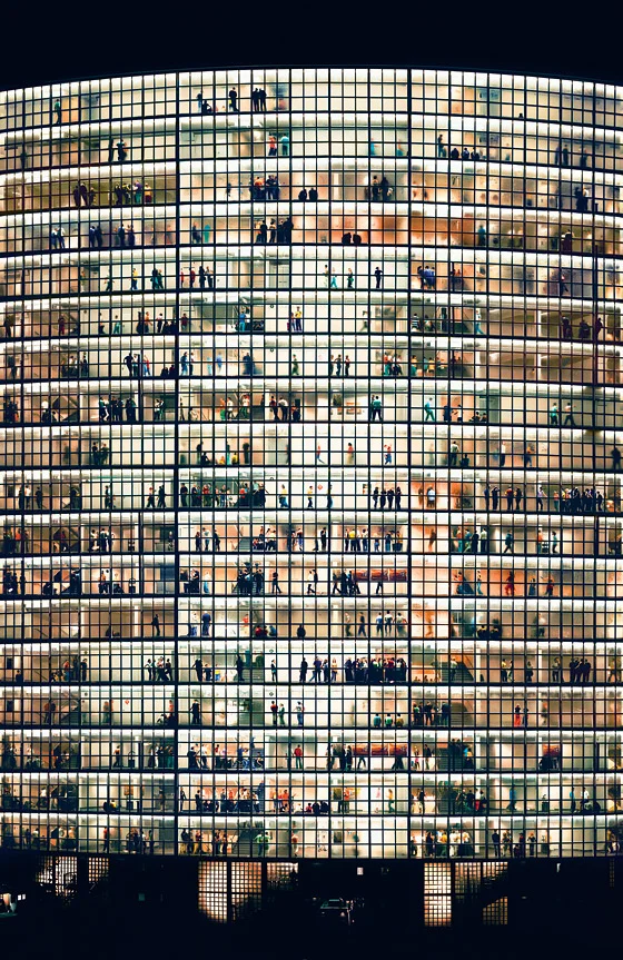


With a seemingly keen awareness of the psychological effects of massive spatial designs, German photographer Gursky Andreas creates images that poignantly hone on graphic, geometric, and rectilinear grounds.

Gini Coefficient: QofL Map
The Gini Coefficient measures the differences in national income equality for countries around the world. A result of 0 represents perfect equality (where everyone has the same income) and 1 corresponds with perfect inequality (where one person has all the income, and everyone else has zero income.
The map charts these results simply by color coding: the closer a coutry's equality is to 0, the cooler the color. If you live in an area with cool colors, the majority of the population enjoys a good Quality of Life (QofL), the best countries being green. Green countries enjoy a larger middle class, a more even distribution of wealth, and a greater Quality of Life for the majority of the population. In these countries, decent jobs provide people with a very decent Quality of Life. As countries move into purple, orange, and red colors, only a small percentage of people can afford what people in the green areas accept as normal, with the warmest-colored countries representing a very poor, even miserable Quality of Life for most people.
Click on the map for a larger view.
(Thanks to my friend Cai, for sharing this find with me.)

A Color-Coded Bookshself
via flickr.com
There is something personal about the way in which people arrange their books. Are they arranged by author, theme, historical period, family heirloom value, alphabetical order? The highly visually inclined might ask, "Why not do it by color?"
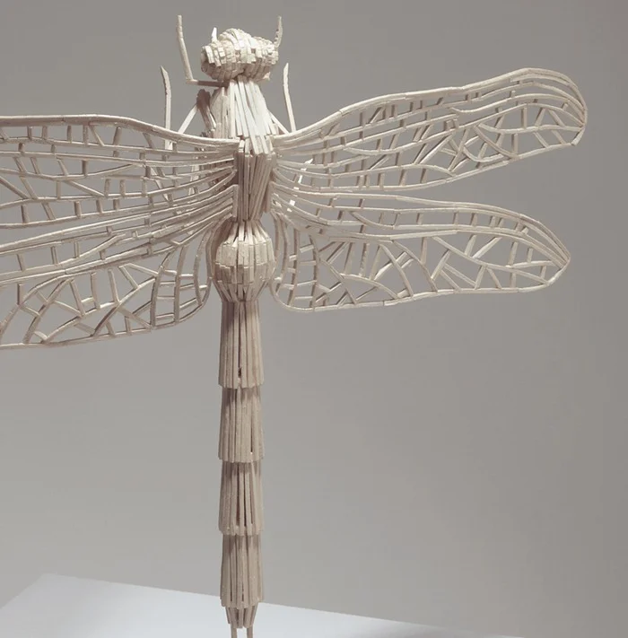
Insects Made From Matchsticks | Amusing Planet
Soviet Posters 1919-1935
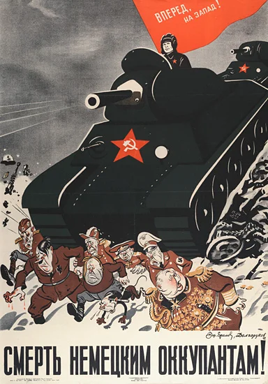
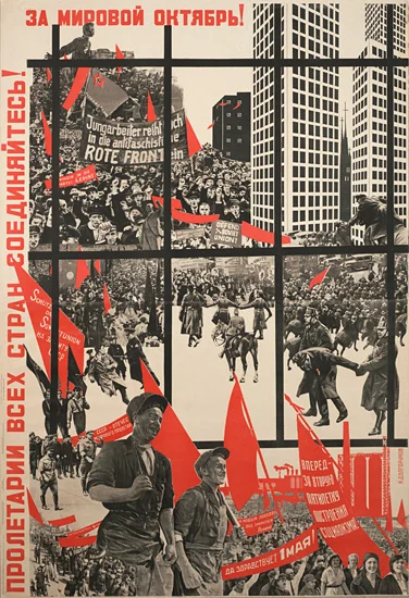
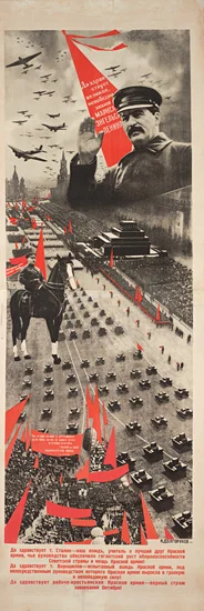
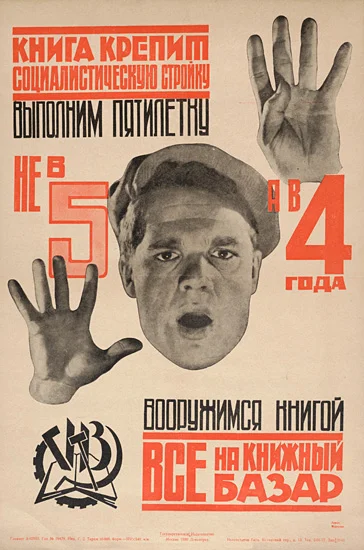
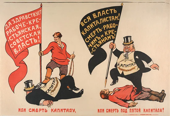
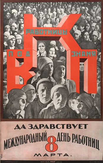
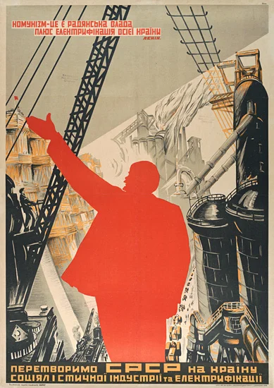
Political posters of the 20s and 30s warn of capitalism's dangers, hail the vision of Marx, Engels, Lenin and Stalin, and praise the proletariat. Though easily dismissible as Socialist Realism influenced by 1920s modernism and the dualism of Friend and Foe (both in domestic and foreign contexts), the posters are diverse in style and sometimes reflect more than a commissioned, caricatured propaganda.
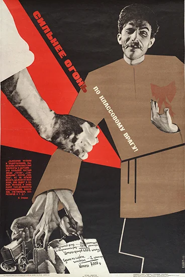
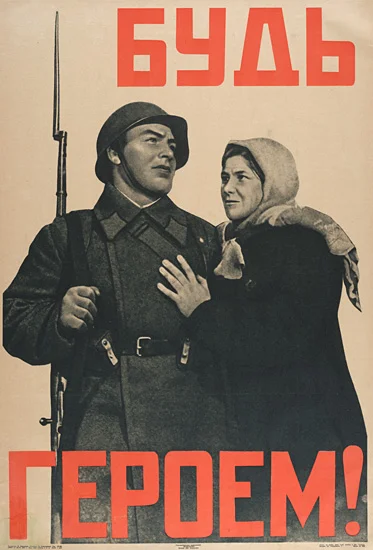
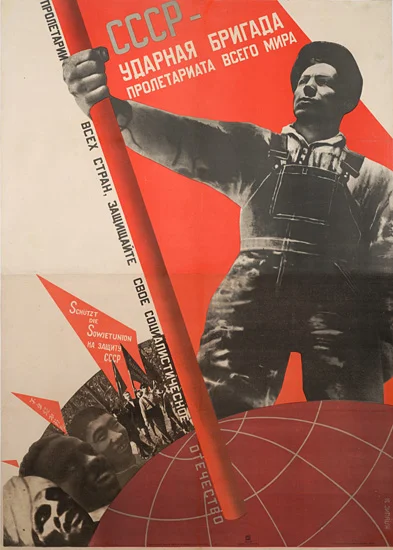
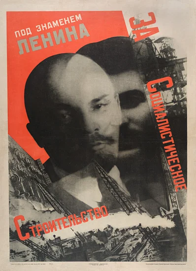
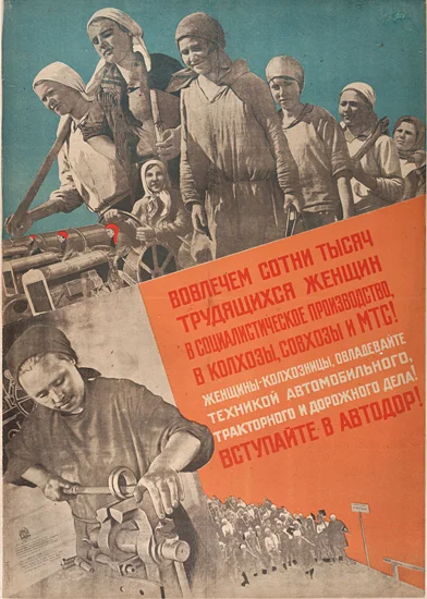
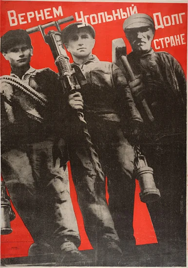
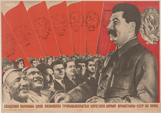
These selections are part of an extensive private collection of posters, postcards, and lithographs from diverse sources. See more at Views + Reviews.
Speakers from Recycled Paper

via jocundist.com
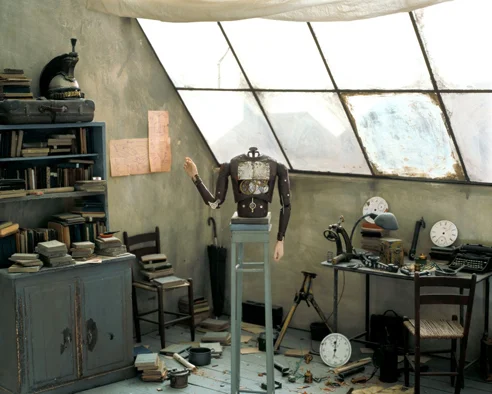
Moody Dioramas & Letterpress Promos
I am a big fan of miniature and moody scenic design. In these wonderfully crafted dioramas, Paolo Ventura creates scenes for an unwritten story he was told in his childhood: L'Automa recreates Venice in the winter of 1942, the set for a story of a man who creates a robot to fight his loneliness after town Jews are sent away.
For part of the show's promotion, the artist worked with a letterpress artist to create a vintage-style poster suiting the style of the diorama and the tale.
In the video, Paolo speaks of winter as a major player in his creations.


Rare Peek: Stamp Sketches
The King’s Stamps — Imprint-The Online Community for Graphic Designers