
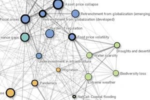
The interactive Risk Interconnection Map, released by the World Economic Forum, shows the interconnectivity between the world's financial ills.
The viewer may be gratified by the ability to select a focus such as Droughts, or Liability Regimes, and watch the components be accordingly re-arranged. Depending on the topic selected, a Likelihood and Severity of the event is displayed on a sliding scale.
The basis for these scales, however, is vague. While the map illustrates the threads that connect global topics, there is little data to evaluate these connections, and the methodology for calculating global risk is not clear. The map's usefulness seems puzzling.
Is this the result of poor planning or is it a case of intentional vagueness by design?