
In a time of design proliferation, increased consumer exposure to design, and a higher appreciation of design in business, it's often confusing for creators to gauge the worth of their skills. Whether Picasso truly said this or not, the point is plain.

U.S. Seasonal Food Production
via flickr.com
A quick glance at the Fruit & Vegetable Wheels reveals that California, its circumference packed with food, is the clear leader in Diversity of Production. A nicely color-coded quartering of the circles organizes the four seasons, and makes it easy to pick out other information that may be less well-known, such as the fact that Connecticut produces potatoes in winter. Design by by BejaminV.
Character Design: Gorgeous Animation with Great, Emotive Character
via vimeo.com
This video, "Float," performed by Flogging Molly, features a delightfully designed stick character through a journey. His physical details, kinetic movement and color lend themselves perfectly to the moody color palette and general setting. Gorgeously shot with a well-crafted tone in setting and character. Wonderful!
Credits: Karni & Saul, directors.
Product Design: Sorapot is cool, interactive and conscientious
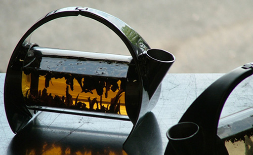


via sorapot.com
This stainless steel and glass teapot not only looks cool, but it's cool for being interactive in two ways:
1. Like many clear teapots, it allows for a spectacular viewing of tea leaves slowly unfolding into a tiny sculptural landscape; and
2. When set on its vertical base, the handle folds back to reveal and release the glass cylinder, which is removable for easy washing.
And to top it off, the rough cardboard packaging is not only environmentally responsible, but adds a great textural contrast to the steel and glass.
Nice thinking, from Joey Roth.
For short city runs, a quick-turning, unicycle-inspired bike is stripped to the essentials.
For inner-city short trips, this bicycle design based on the simple unicycle provides much convenience: compactness, quick turns, chain-less, grease-less mechanism for minimal maintenance, fast stop-and-go reactions, and rear-wheel power for going over curbs. It's all about making a quick dash to neighborhood establishments.
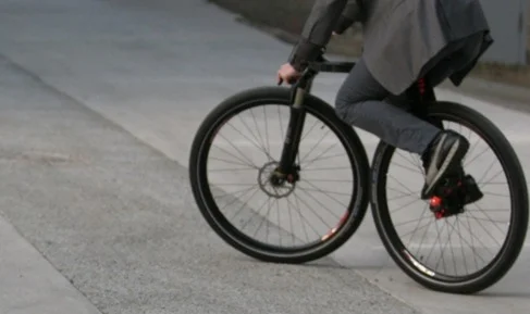


The bike, designed by JRuiter + studio, is in prototype phase and has been entered in art contests.... bending the categories of design and art. Why not? The design is strikingly simplistic, evoking an appreciation for the simple line. It might also evoke some skepticism over its usability, but if the intended use is narrowed to inner-city lifestyle, and bars long-distance or performance biking, it seems perfectly fitting for the task.
The design is an achievement both aesthetically and conceptually. I'd love to try one out to test its functionality; I suspect it would take a little getting used to, but I'm sure the quick turns and its ability to wiggle through tight spaces would be very satisfying.
The simplicity of the design reminds me of simpler bikes from days long past, as if the quest for self-powered, wheeled transportation has come full-circle with this bike, but with all the benefits of hind-sight.
Color: Masterful use of color in works by Andy Gilmore.


The lines between art and design can often be blurry, but Gilmore's bold hand seems to effortlessly explode with color and graphic organization. Piece after piece, his body of work appears to reinvent the color wheel, resulting in a collection that inevitably makes us ponder the boundaries between art, design, and illustration. It's little wonder the likes of Wired Magazine have picked up his talent.

Ad Campaign: Funny Viagra Ad for Mexico market: Twister time!
I wonder if insurance covers the sheets.
Credits:
Agency: Ogilvy & Mather, Mexico City, Mexico
Creative Directors: Marco Colín, José Montalvo
Art Directors: Alejandro Guadarrama, Carlos Oxté, Aurora Morfin
Copywriters: Carlos Oxté, Alejandro Guadarrama
Photographer: Flavio Bizzarri

Infographic Design: on Rates of Worldwide Innovation
This graphic organizes data about the rates of patent filing worldwide. Interestingly, it seems to have spurred an online discussion whereby the chosen data has been put to question. Specifically, the graphic appears to make no distinction between different industries and the innovations produced by them. The electronnic industry, for example, is known for rapidly producing patents, while other industries have a slower rate of patent adoption. As a result, countries whose innovation is highly dependent on the electronics industry will produce a higher number of patents annualy—the basis of "innnovation" in this set of data. As a result of this data selection, the infographic identifies Korea as the world's leader in producing innovation. Is this an accurate conclusion?
The graphic does a fine job of representing the data in an easily-decipherable visual way—perhaps a title tied to "Patent Filing" rather than "Innovation" would more accurately describe what the graphic represents.Credit: Grant Thornton Accounting
Design Trend?: "People are sick of that tech look," says head of Makr, but is it just about looks?


"People are sick of that tech look—nylon, overly masculine," says Jason Gregory, owner and designer of Makr Carry Goods.*
The Duluth-Pack-inspired Farm Ruck bag (above) is, like all Makr Carry Goods, hand-sewn and made in the USA in a workshop with with low-waste microproduction methods. Every element of the company's products is hand-crafted in small batches, on-site, by local Florida artisans. The bag's design is strongly bound to production methods that purposefully diverge from mass production methods, from non-organic material, and from outsourcing conventions.
Conventionally, many apparel and accessory designers from other companies that employ an "alternative" or otherwise "anti-civilized" ideal (as in the early slogan of The Territory Ahead, borrowed from Mark Twain's Huckleberry Finn) stop at the design level while production is outsourced abroad for conventional, mass manufacturing. Such are the current normative constraints of cost control. But perhaps these companies have lessening reasons for fearing low sales on products with a higher retail price.
Does a downturn in "the tech look" echo growing consumer malaise over other things technological, or even over other ripples of modern life? If so, there may be a widening opportunity to marry design to responsible production and, by extension, to more responsible marketing and consumer trends.
The Fall 2010 apparel collection seems to have reflected this. According to Fast Company, other apparel brands including Marc Jacobs and Chanel launched similar rucksacks in the Fall 2010 collection, and at higher prices than Makr's US$150 bag. In so doing, they tapped into the 60% of accessory buyers who are willing to spend US$300 or less as a simple investment—a large market willing to spend on quality craft over inexpensive manufacturing.
Perhaps then, a growing number of designer-manufacturers may find greater reasons to launch product lines, if even signature lines, based on domestic artisanal production across apparel, accessories, textiles and footwear. Consumers might just be ready to embrace this on an increased scale. After all, if we are what we eat, are we not also, in body, mind and soul, what we consume in general? While spending $150 for a bag may appear to be piggish to some, it's arguably less piggish than buying a $30 bag whose low-cost manufacture is essentially subsidized by high-waste mass production, among other high-cost by-products.
Here's one for the well-made, locally-crafted, simply designed things.
* Excerpt from Fast Company at: http://bit.ly/bVsDgV
Wayfinding worldwide symbol collection for download from AIGA


via aiga.org
In the 1970s, AIGA and the U.S. Department of Transportation collected the most common and effective symbols used worldwide to help manage transportation information in public places.
These sure beat the written out "Don't Walk" signs on every street corner of major U.S. cities—positively inconsiderate of visitors from other countries or people who may be challenged in literacy for any number of reasons.
The symbols selected and adapted by AIGA and D.O.T take in to consideration the cultural differences and various interpretative abilities of the pubic, striving for clear, easy-to understand iconongraphy. Now that's considering the goal (public safety) and the end-user (a broad array of people.)
These are now available for download on AIGA's site.

The Design Process: It's about vision and optimizing the scarce resource, says F. Brooks
Master Planner: Fred Brooks Shows How to Design Anything
via wired.com
Take it from a man that grew up in the 1940s: The design process is chiefly about planning how to achieve desired results with the resources at hand, and about understanding the deep-rooted need for the desired goals, via vision.
Computer scientist Fred Brooks explains:
"The critical thing about the design process is to identify your scarcest resource. Despite what you may think, that very often is not money. For example, in a NASA moon shot, money is abundant but lightness is scarce; every ounce of weight requires tons of material below. On the design of a beach vacation home, the limitation may be your ocean-front footage. You have to make sure your whole team understands what scarce resource you’re optimizing."
"Edwin Land, inventor of the Polaroid camera, once said that his method of design was to start with a vision of what you want and then, one by one, remove the technical obstacles until you have it. I think that’s what Steve Jobs does. He starts with a vision rather than a list of features."
Excerpts from: Master Planner: Fred Brooks Shows How to Design Anything, Wired Magazine, August 2010

Design Simplicity: What one key element can do: Hitler and Chaplin for a hat ad.
This brilliant direction reduces Hitler and Chaplin to their most basic, common iconographic elements, with the hat as the key differentiator. A poignantly memorable visual solution for the campaign slogan: "It's all in the hat" for hat shop Hut Weber.
Concept direction and design simplicity at its best!
Credits:
Creative Directors: Axel Thomsen, Alexander Schill
Art Director: Jonathan Schupp
Copywriter: Francisca Maass
Agency: Serviceplan Hamburg
Mobile Media parallels Ancient Art: It's all about identity and networking
A Cambridge PhD student in the fields of archaeology/anthropology/ethnography overheard a conversation about networking, and responded with an anonymous letter, some key excerpts of which are below.
We may all intuit that our digital gadgets are merely new tools for age-old human behavior, but here are some specifics from the loupe of academia:
" ...many archaeologists are now beginning to realise that the behaviour of people (I am referring to stuff that was going one about 20,000 years ago when mobile art, figurines and parietal—cave—art largely first appeared in Europe) had much to do with building and maintaining networks, not just with people but also with other elements of the world."
" ...some archaeologists are now discussing the role of possessing and interacting with mobile (e.g. animal) figurines as a means of creating and maintaining human identity."
" ...the way that people engage with objects and media (e.g. mobile phones) in the Western’ world today is not so different to 20,000 years ago."
—Anonymous Cambridge PhD student in the fields of archaeology/anthropology/ethnography, in response to a discussion about networking between Alan Moore and a colleague. Full text at The Do Village.
Something for designers and marketers to keep in mind.
Paper Worlds Underscore Books
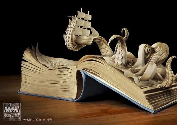
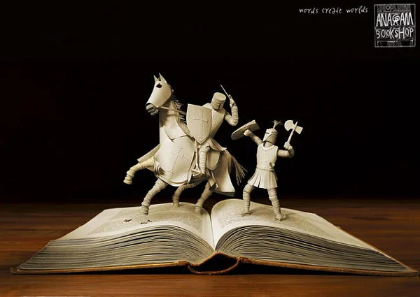
Stunning images made from paper sculptures were created for a Czech bookstore, Anagram, whose slogan is "Words Create Worlds"—a perfect art direction for the slogan, with outstanding technical execution.
Credit: Kaspen agency

Design Power: Why design stimulates the mind.
Francisco Inchauste, via Design Informer:
"Design is powerful because of the way our brain processes visuals. [...] 30 areas in the back of the brain process an image [...] In reality, design and art stimulate the mind more than a realistic image would do."
Early 20th C Newspaper Sites
These are wonderfully detailed in the tradition of early 1900's newspapers.
Note the three very different approaches to integrating the graphics with varying degrees of functionality.


Past meets Present: Contemporary Byzantine Iconography parallels elements of graphic design
via flickr.com
I'm delighted to have stumbled upon these examples of contemporary Byzantine iconography—an art I'd long ago mentally shelved as an item of art history past.
The work of Ukranian artist Valentin Streltsov and his team could be right out of the history books (from what I've seen as an art student; I claim no expertise in the style), but unlike said books, with Stretltsov, we have the opportunity to view photographs of massive murals in the works.
With its vibrant colors, dazzling gold foil, simplified forms, and geometric boldness, the Byzantine style's parallels to graphic design are hard to miss. This distant cousin to graphic designers is most welcome here as a source of inspiration!