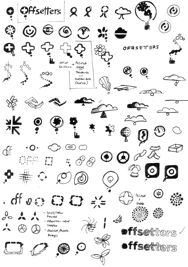
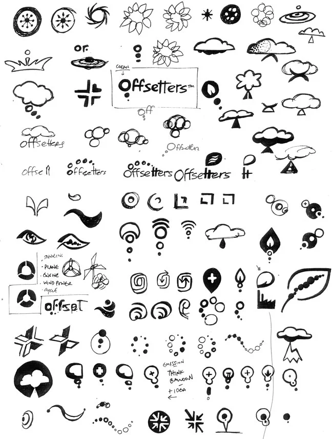
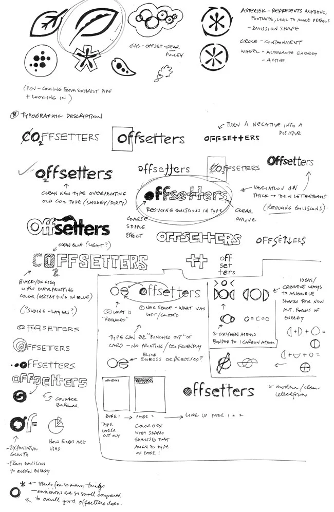
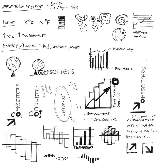
"Graphic Designers and Visual Communicators are Management Consultants."
—Neville Brody, Research Studios
"Graphic Designers and Visual Communicators are Management Consultants."
—Neville Brody, Research Studios


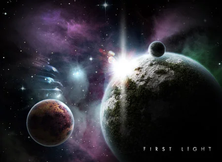
In a world where so much is forced to exist within rectilinear convention, a successful application and fresh approach to curves seems to feed life to the subject. From a distance, this bold wave almost appears to have been drawn on the horizon line by a single, graceful stroke of a pen. Lovely.


The campaign certainly makes the point. In one ad, a visibly pregnant nun holds up Federici Gelato, captioned as "Immaculately Conceived," while in another ad, "Salvation" is suggested as two priests share a moment of gelato sin. Perhaps the imbedded social commentary isn't suitable to everyone's taste, but it certainly underscores the product's alleged sublimeness bordering on sin.
Gelato maker Federici timed the advertising campaign around a papal visit in the U.K., earning the company an advertising ban that it has pledged to fight.

From a design standpoint, something about the graphic leaves something to be desired. The billionaires singled out with their affiliated companies could, for instance, be highlighted in a different color on the global map, for the reader to more easily assess which geographical area they are in. Where, for example, is Red Bull pointing to in that cluster somewhere around Switzerland?
Still, an interesting set of information.


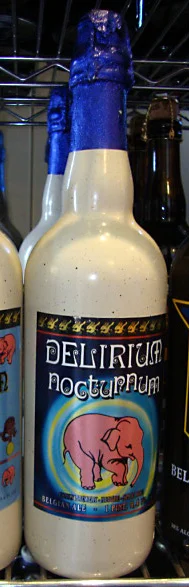
I had to laugh when I found this label's promise of delirium delivered by a pink elephant! Fun branding for a Belgian Beer.
Today, I'll only take the photo. Tomorrow... maybe a test drive. :P
GE's Ecomagination Challenge pledges US$200 million in seed grant to the winning idea.
Users can spin through ideas and sort by three categories: Power Generation, Power Connection, and Power Use. Larger dots indicates more votes received; each dot is clickable for more information.
A good, clear graphic.
Contest is open for 6 more days; votes are live through then.
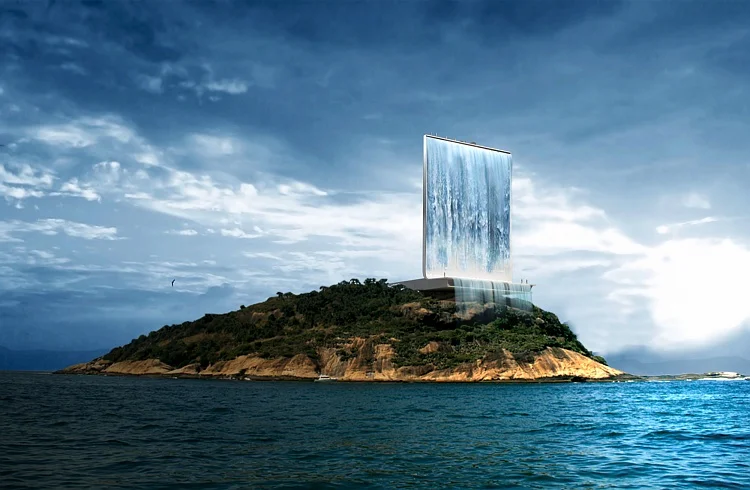
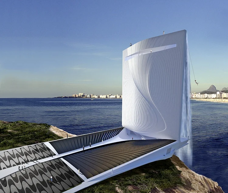
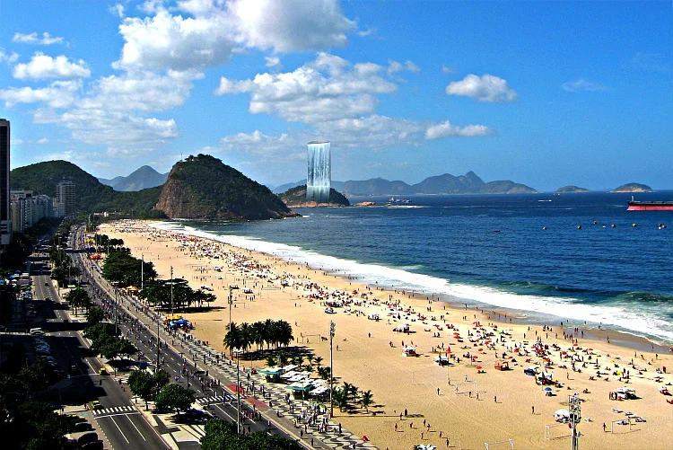


Breathtaking and energy-conscious, this Olympic waterfall tower proposal for the Rio 2016 Olympics would employ solar-power to pump water and generate electricity for the city of Rio. It includes public spaces and an elevator to the observation deck at the top which provides a 360° view and a glass sky walk over water.
To top it off: a bungee-jumping platform.
Credit: RAFAA architecture & design, Switzerland

This infographic organizes data from 2009 for U.S. drivers divided by age, sex, geography, and a 10-year comparison. California, Texas and Florida stand out as highly concentrated areas of fatal crashes—a piece of data on the subject matter that may not be obvious at first thought—the graphic hereby adds an element of discovery to most readers.
From a design standpoint, something about the understated color palette, plenty of negative space and slightly vintage approach add a gentle touch to a not-so-pretty topic, somehow managing to take the edge off the subject-matter. Interesting approach, successfully executed.
Credit: Gavin Potenza


It looks like some creative amputation and re-attachment went on in some of the more intensive designs!
More examples at Design Stuff Daily, with sources listed.
Shop at Kidrobot.

Most people are aware of the challenges posed by Dyslexia or Color Blindness, but there are other, less well-known visual impairments that can also challenge a viewer's comprehension of visual information: Central Field Loss, Contrast Reduction, Peripheral Field Loss, and combined Peripheral & Central Field Loss.
The Museum of Teaching and Learning (MOTAL) is proposing an exhibit that illustrates this lesser-known, but equally challenging group of visual impairments. The exhibit, designed in collaboration with Chapman University Design Professor Claudine Jaenichen, will invite visitors to wear "tainted" glasses designed to simulate these various visual impairments, giving viewers a first-hand experience of the resulting altered comprehension.Visual learning disabilities may not always be easily accomodated by design solutions in the practical world, but they are worthy of keeping in mind when design is called upon to serve a need where there may be an increased number of visually-impaired users or audiences.


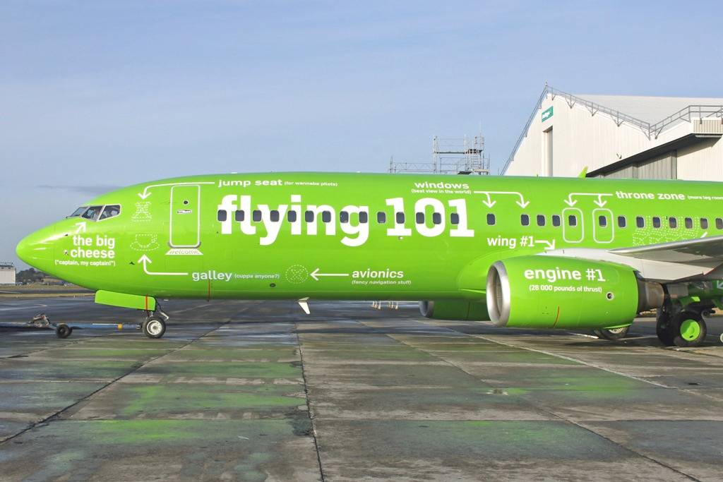


Kulula is a low-cost airline from South Africa with planes designed to teach and entertain—click through the images for progressive close-ups.
To complement the brand experience, attendants and pilots fill their announcements with humor:
"Please pay attention to the safety announcement, because you will be writing a test shortly."
"If you are caught smoking, you will be asked to leave the aircraft."
"You could be fined up to R 7,999 for smoking on the plane, and for these prices, you could be flying SAA."
"Please take all of your belongings. If you're going to leave anything, please be sure it's something we'd like to have."
"Welcome to Johannesburg. If this is not where you were intending to go, then you have a bit of a problem."
That's one airline that'll be hard to forget.
See similar: Southwest Airlines steward busts a Safety Rhyme